Before / After Summary Snapshot:
UI Redesign of Google ‘twoSTOp’ Cases Consult Contact Manager
Paul Smith <paulsmith@google.com>
Date: 03-15-2013
twoSTOp - fixing a messy 'frankenstein' UI
Problems: The consultant that selects a new case from the tickets list is sent here to review existing Case info in a gmail-style thread. Actions include accepting / rerouting consults, replying, marking as resolved, etc. Some info from the imported Cases UI is useful, however, a great deal of visual noise impedes the user experience; much of the data seen currently in the iframe is irrelevant and distracting. Another major issue is that the main workflow focus, the message thread, is only given a tiny percentage of real estate and pushed way below the fold. Most of these problems are a result of hasty engineering to force-fit the existing 'Cases' UI via iframe into a cobbled together overlay UI of disorganized controls to fit every edge case.
Solution: The redesign was based on surveys and user interviews to determine primary user flows and controls. The imported iframe UI was eliminated and the new interface only includes primary actions in typical order per use case flow. Primary message thread is moved up and maximized, and all relevant related info is available in side bar, above the fold. CSAT scores improved from 2.2 (before) to 4.4 (after) and TOT in user testing averaged 70% faster*.
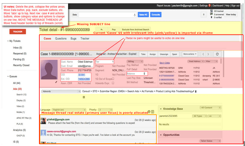
BEFORE: twoSTOp ‘cases’ consult view 09-01-12:
Notes:
-
Delete the pink area content; collapse / redesign the yellow area content.
-
Move Data button, pop, back, exclude buttons, etc.
-
Move ‘tabs’ ('cases', 'questions', etc) up to top,
-
Next row: case # and actions buttons; include SUBJECT text
-
Show category value and options to change on one line,
-
MOVE THE MESSAGE THREADS UP.
-
Move fixed header border to top of threads (scroll)
-
Eliminate inner scrolling and iframes.
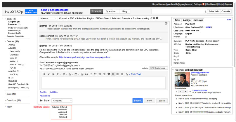
AFTER: Updated UI Redesign Mock - Consult view - 11-08-12:
Notes:
-
Main work flow, the Message thread moved way up to the top and maximized, so consultants can scan messages quickly.
-
Irrelevant 'cases' info now hidden.
-
Previously missing Subject line is now visible and prominent.
-
Consult reporter and cases customer info now fits above the fold.
-
Tracker info and actions fits neatly into the right column.
-
New design will be replacement for ‘cases’ tab view, and also now for ‘tracker’ info.
-
Tracker tab is no longer necessary, all state changes are visible and editable on right.
-
Show state changes in tracker right column, eg, if a mail thread is marked resolved in cases, then it also shows in right, etc.
-
Browser scroll moves only the message area.
-
Added more tracker controls and info per usability testing.
-
Made 50 character length for the summary description at top - hide overflow show on hover.
-
New signal icons for tab buttons (see question and bug mocks).
-
Data download moved into tickets list view.
-
Added edit functionality to summary at top.
*(see usability study notes)